Comparative Analysis Dashboard
(Link)1. Overview
We have Excel file: Budget and Sales Data.xlsx. Excel file has three sheets: Budget, Sales and Product Master
Open Power BI and get data from Excel. We need create table Date Dimension to enhance the date and time-related analysis and reporting
Create relationships between tables: Budget, Sales, Product Master and Date Dim.
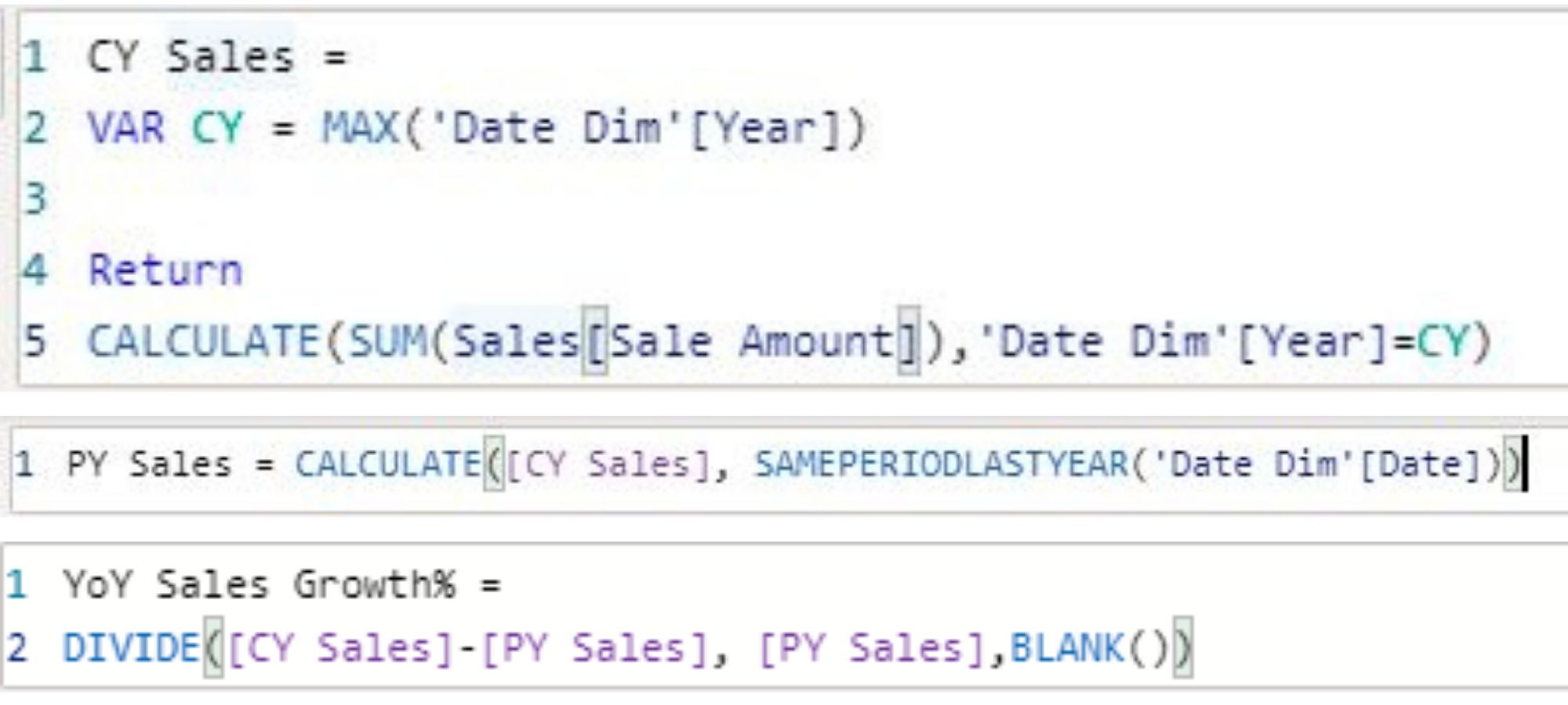
Create measure Current Year (CY), Previous Year (PY), Year over Year (YoY) for year-to-year comparison

Create Budgeted Sales and Budget Variance% measure

Power BI Card is useful to display a single number (or metric value)
We can see imagine below. In 2020, Sales reach 723.7M, 23.6% lower than the budget and 18.5% lower than the previous year's sales
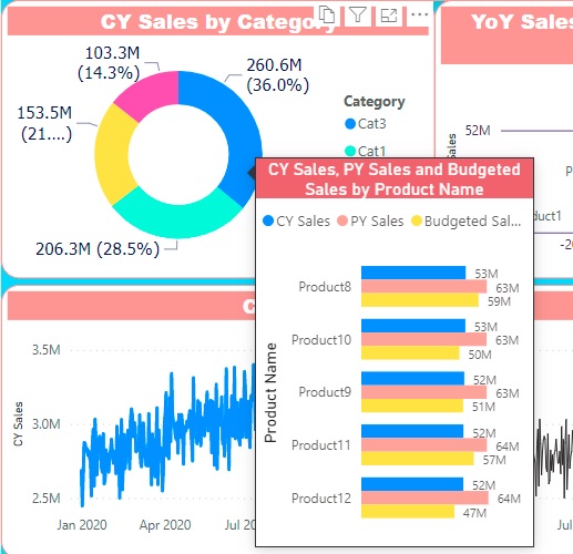
- Look at the Donut chart, we see that product category 3 (Cat3) accounts for the highest sales (36%) in 2020. Followed by Cat 1 reaching 28.5%, Cat 4 reaching 21.2% and the lowest being Cat 2 reaching 14.3%
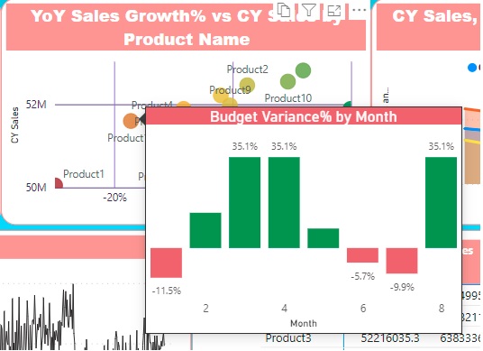
- With scatter chart shows the relationship between CY Sales and YoY Sales Growth%


Referenced from https://www.pk-anexcelexpert.com